
How to Design a Captivating Tattoo (or any work of art)
- Mar 16
- 4 min read
Have you ever seen a tattoo that you just wanted to stare at?
Not necessarily because it was shocking, or because the technical execution was flawless. Not even because the subject matter was interesting to you.
But something about it kept pulling the eye back in.
Or maybe you’ve had the opposite experience. A tattoo that should have held your attention—technically impressive, visually complex, clearly the product of real skill—yet it somehow left you cold. Your eyes glazed over it and moved on.
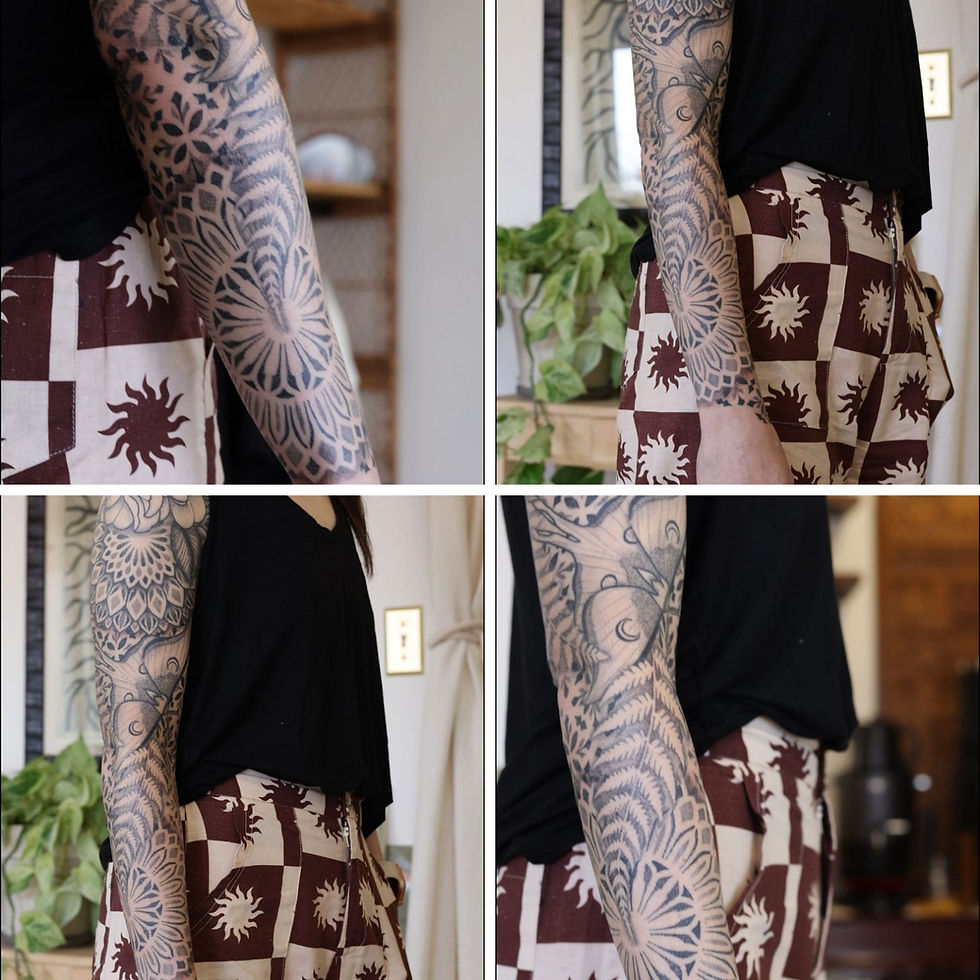
Surprisingly, the difference often doesn’t come down to the quality of the line work, or the shading, or the subject matter—it comes down to composition. That is to say, it comes down to whether or not the artist thought carefully about the path your gaze would take through the piece.
There was a study done by researchers in Italy, where they fitted museum visitors with eye-tracking glasses and watched, in real time, exactly where their gaze went as they stood in front of a Caravaggio painting. They observed forty different people of differing ages and backgrounds, all strangers to one another. What they found was that almost every single one of them moved through the painting in the same way. Their eyes went to the same starting point, then followed the same path, and experienced the same sequence of discoveries.
The conclusion was simple: Caravaggio built that path into the painting. The eye didn’t find it by accident. The viewers didn’t independently choose where to look. The intention of the path was placed there, four hundred years ago, and still works on everyone who walks through the door.
This is something the great painters understood long before anyone had the tools to measure it. Your eye enters a composition at its point of highest contrast. The brightest light against the deepest shadow. The most saturated color in an otherwise muted scene. From there, the relationships between elements move it along. Maybe a figure pointing across the canvas directs you to the object of their focus, another person perhaps. Then, their gaze, directed upward, lifts yours with it.
The angle of a flame, the way cloth moves in wind… it all implies direction. And the eye follows.
The best compositions don’t just arrange objects, they arrange a sequence of moments. They decide what you notice first, what feeling you carry into each new discovery, and where you end up when the journey is done. When all of it is working, your eye doesn’t leave or get bored. It’s placed on a continuous track through the piece, always with somewhere to go.
This is what separates a tattoo you glance at from one you can’t stop looking at.
Now of course, the canvas is different. It’s three-dimensional, it moves, and often people will see it in sections depending on how the body is positioned. But the underlying question is the same: where does the eye enter, and where does it want to go from there?
So what makes an effective entry point? Usually the most visually dominant element, the highest contrast, and the most complex focal shape. That’s where the eye lands. Then, secondary elements give the gaze somewhere to travel.
Lines of movement can carry the viewer across an entire section of the body. Circular shapes are stabilizers that stop the eye, let it rest, then release it back into the flow. Sharp angles can build energy. Curves create flow.
Take this in-progress geo-ornamental leg sleeve I’m working on. If looking at the side of the leg first, the eye is drawn to the most recognizable and intricate shape first (the key). The key then points downward leading into the mandala over the knee. The mandala has shapes that radiate outward at all angles, so there are ornamental bands on both the top and and bottom that will catch the eye regardless of which direction it moves. Since they spiral down and around the leg, they’ll then move the gaze to the imagery on the back of the calf.

So, what happens when a piece has no intentional path or connecting elements?
Equally dominant focal points without anything connecting them will cause the eye to bounce back and forth uneasily. This can feel unsatisfying without the viewer being able to say why. The eye has nowhere to go. It just ricochets or leaves the frame.
Wherever the gaze lands, you want to give it something to do, and somewhere to go next. This gives the artwork a rhythm. That’s the tattoo people can’t stop staring at.
So, next time a piece of art catches your eye—a painting, a tattoo, anything—notice where you look first. Then notice where you go next. Ask yourself whether a path was laid down for you, or whether it just feels scattered. If your eye keeps returning to the same element, ask why. If you feel vaguely unsatisfied without knowing why, ask whether the composition has an intentional path. Ask what the artist wanted you to see, and compare that to what actually happened in your head. You’ll start to feel the difference between work that was haphazardly placed, and work that was composed.
If you’re thinking about a large-scale piece and want to talk through how to build something that holds together as a single visual experience, that’s a conversation I always love to have! You can reach out through my booking page, or subscribe to my newsletter to receive future essays as they come.
— Kyle


Comments